Graphics Viewer Overview
The Graphics Viewer is the component of the Graphics application that allows you to view the graphics representing your facility or equipment. It is where you can change the current state of an object’s properties from a graphic, by using the floating Status and Commands windows. You can filter your view of a graphic by discipline, section, or you can zoom in and out for greater detail or for a birds-eye overview.
For specific reference information, select from the topics below as needed:
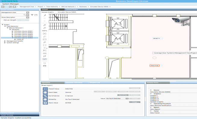
Desigo CC allows you to manually associate objects to one-another. For example, you can associate a fire detector (or any other object type) to a video camera or to a document. Then, whenever the fire detector is selected in the System Browser tree, the related video camera or document displays in the Related Items tab. The Coverage Area feature provides a graphical way to achieve the same result.
Desigo CC graphics can contain cameras or monitoring devices to which objects, such as fire sensors, ceiling sprinklers, temperature sensors, etc. are associated. For example, you have a graphic of an office space that includes a camera that is monitoring the fire sensors in that room. In this example, the fire sensors monitored by the camera, are in the coverage area of the device.
The coverage area contains the monitored objects. When you move your cursor over the coverage area, a tooltip displays the coverage area's object reference with the total number of monitored objects. If you move your cursor over an object in the coverage area, a tooltip displays the object’s name or description. The background color of the coverage area varies depending on the configuration of the project.
When you initially load a graphic, the coverage area of a camera is not visible in the Graphics Viewer. You must toggle the Coverage Area icon from the Graphics Viewer toolbar to view the coverage area of any monitoring devices on the graphic.
The Operation and Extended Operation tabs display the device properties when the coverage area is visible. The Related Items tab lists any coverage areas that are associated with the graphic under the heading that is named after the type of the monitoring object. For example, if the monitoring object is a camera, the heading displays Camera in the Related Items tab.
Graphics related folders are displayed in the Application View and Management View of the System Browser. Existing graphics associated with your project are listed and viewed from the Application View tree, under the Graphics application.
There are three types of graphic folders: Graphic, Symbols, and Graphic Templates.
- Application View > Graphics: Displays all project graphics (*.CCG) files.
- Management View > Project* > System Settings > Libraries > [Appropriate Sub-Library] > Symbols: Displays all the related Symbols (.CCS) files associated with the selected library.
- Management View > Project* > System Settings > Libraries > [Appropriate Sub-Library] > Graphic Templates – Displays all the related symbols (*.CCT) files associated with the selected library.
*If your System Browser display mode is set to Show Name, you will see Management View instead of Project.
The Graphics Viewer allows you to display dynamic graphics of your building control system. Within System Manager, you navigate the various views of System Browser to select the objects you want to display in the Graphics Viewer. System Browser displays only the objects in the system that you have access to, based on your user profile and privileges.
Primary and Secondary Selections
When you select a graphics object from System Browser, the Graphics Viewer displays the representative graphic. The selected object is considered the primary selection. The object properties also display in the Operation or Extended Operation tab. The graphic that has the primary selection displays the name of the graphic and the object name according to your Display selection in the System Browser.
Additionally, the properties of the primary selection display in the Operation or Extended Operation, and the Detailed Log tabs. The Related Items tab displays objects related to the currently selected object. Each related item is assigned a group name that represents the object's type, for example, graphics, trends, reports, or schedules.
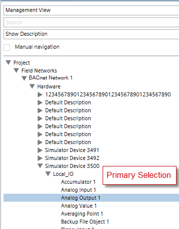
If you click a Symbol on a graphic or, the referenced object of the Symbol becomes the secondary selection, while the primary selection remains the same in System Browser. The following figure illustrates the primary selection in System Browser, Analog Output 1.
In the Graphics Viewer, the Operation tab changes its display to correspond to the new, secondary selection. System Browser displays the original, primary selection, to show your starting point.
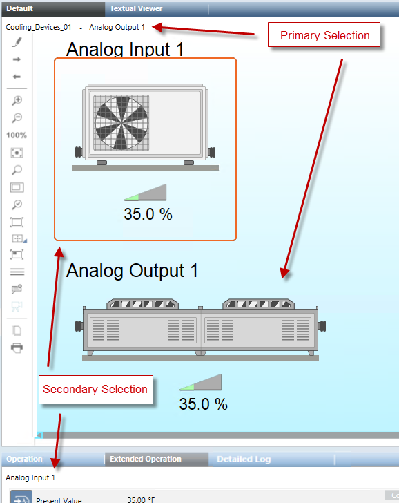
When you select an object from System Browser that is associated with a graphic, the Graphics Viewer displays the representative graphic and the object’s associated Symbol on the graphic is selected. As a result, the Operation tab displays the object properties to correspond to the selection.
Double-clicking a Symbol on a graphic makes the referenced object associated with the Symbol the primary selection in System Browser and all workflows update accordingly.
Point Centered Display mode ensures that a selected data point or group of data points will always be centered in the Graphics Viewer.
For example, you might be required to put a data point in this mode if you are monitoring a fire system in a chemical manufacturing facility with key sensors that must always be viewed. Enabling Point Centered Display mode in such a scenario ensures that the data point does not blend in with and become lost among surrounding graphics. Or, you might be required to put the Graphics Viewer in this mode, if, for example, you are monitoring a fire system in a pharmaceutical manufacturing facility with key areas that must always be viewed. You can also enable the Group Center mode, to ensure that the parent and all children of the selected point are always selected; therefore, the group of points does not blend in with and become lost among any surrounding graphics. In Group mode, siblings are all data points with the same parent as the selected data point. Those siblings are retrieved from the currently selected view when the selection in the System Browser changes. This mean that selecting the same data point in different views, such as Logical or Management View, could return different siblings.
To implement the feature, you select a data point object in System Browser. The System Manager application then opens the Graphics Viewer and displays the point’s default graphic view, depth, and graphic associated with it. You then select the Point Centered Display mode button from the Graphics Viewer toolbar to center the point in the viewport. The feature is disabled by selecting the button again.
While in Point Centered Display mode, you cannot pan the object. However, you can select any zoom factor without affecting centering in the viewport or you can select another symbol to shift the focus to another object or Symbol.
Scope is a grouping of system objects, or nodes with specific scope definitions used for the purpose of assigning access rights. You can create scopes and assign access rights to any of the graphic nodes in the Graphics system tree. For more information, see Scopes.
You can apply scopes to the following graphic nodes:
- Graphics
- Symbols
- Templates
- Manual and Automatic Pages
Data Point Access Privileges
Data points are integrated into a graphic by associating them with elements. These data points and elements can be evaluated by creating expressions that result in a graphic that allows you to view dynamic values of a facility, building, or piece of equipment. Data points therefore always display using the elements they are associated with.
Depending on your access rights which are set in the System Manager certain data points can be inaccessible. In this case, if one or more data points associated with an element is inaccessible, then the associated element will not display in the graphic while in Runtime mode or in the Graphics Viewer. However, the parent of an element, such as a symbol instance or a group, and any other associated children (elements), are not affected and will display on the graphic. This is considered the Hide-Rule for data points in a graphic.
The Hide-Rule does not apply to Object References and Link References since there are no COV subscriptions involved in these scenarios.
When a data point with an existing address is subscribed for COV’s, the data point’s status and value are updated automatically in the Value Simulator. If the status for the data point displays General Access Denied, the data point is inaccessible and therefore not readable for COV subscriptions.
Access levels are the security rights users are granted to access applications and objects in the Desigo CC software. The access levels for the Graphics Viewer, Graphics Editor, and Graphics Library Browser are as follows:
Graphics Viewer
The access rights for the Graphics Viewer application define the user’s ability to display a graphic or a symbol in the Graphics Viewer and in the Graphics Editor Runtime mode.
Graphics Viewer: Security | |
Access | If Enabled |
Show | You can display a graphic in the Graphics Viewer and in the Graphics Editor Runtime mode. |
The Status and Commands window displays on a graphic, and allows you to display and change the current state of an object’s properties in your building control system. Access to objects is based upon the object privileges and privilege profiles set by the system administrator.
Display of Properties on a Graphic
Properties display on a graphic in one of two ways—automatically or manually.
- They display automatically when a property goes into an off-normal state. The Status and Commands window displays the icons associated with the properties in an off-normal state on the graphic. You expand the icon view to display the detailed property information and the command options.
- The Status and Commands window displays manually when you right-click an object in a graphic that has data points associated with it. You can display multiple Status and Commands windows in Graphics.
When a Status and Command window displays on the graphic, a connection line displays between the window and its associated objects on the canvas. The connection line between the Status and Commands window and the objects remains intact, even when the window is moved around on the canvas.
Properties and commands also display in the Operation and Extended Operation tabs for the selected object.
For more information on commanding properties and priority arrays, see Command Priorities and Priority Arrays.
Summary Status
In order to simplify the system display and highlight the most important information, the system sometimes combines properties into a Summary Status property. The Summary Status displays the highest priority status that is currently active for an object. For example, if an object has an active Fire Alarm and Fire Fault, the Fire Alarm displays in the Summary Status.
More About the Status and Commands Window
The Status and Commands window is a floating view that displays over an object on the canvas, and can be moved around in the Graphics Viewer. The Status and Commands window displays a connection line to its associated objects on the canvas. The connection point of the connection line, anchors itself in the following manner:
- Non-engineered elements: The connection point aligns itself to the center of the element.
- Symbols: The connection point aligns itself to the center of the first element in the symbol, according to the element tree.
- Customized Connection Point: You can create a connection point location by drawing an ellipse where you want to anchor the connection point for the symbol. In the Ellipse Descriptor field, you can enter text stating it is an Anchor for the Connection Point. To hide the ellipse from view, either cover it up by another element (preferred method) or disable the Visible property for the element in the Property tree. In both cases, make sure that the ellipse is the first element in the Symbols element tree in the Element view.
For graphics and graphic templates only, you can specify the maximum number of connection lines to display. The default value of 65535 is used when the property Graphics > Max Connection Lines is left blank, in which case under normal circumstances all lines display with the Status and Commands window. If the actual number of connection lines associated with a Status and Commands window exceeds the number of connection lines specified in this property, then none of the lines display.
Drag-and-Drop
The Status and Commands window is a drag source for data point properties. When the Status and Commands window is expanded, you can drag a data point or one of its properties from the window to any of the drop targets in the Graphics Editor or other applications. You cannot drag-and-drop virtual data point properties, such as those properties that display No Properties or Not Available.
- Evaluation Editor: When you drop a data point property in the Expression field of the Graphics Editor’s Evaluation Editor, the current value of the property displays in the Result field for the element’s property.
- Ribbon: When you drop a data point property onto the ribbon, all the graphics associated with that data point display as tabbed graphics in the work area.
- Graphic Canvas: When you drop a data point property onto the canvas, the associated data point symbol displays on the graphic.
For a list of the drop sources in the Graphics Editor, see the Table of Graphics Drop Targets.
Tooltips are customizable properties that display as a yellow text box when you mouse-over an element or object on the active graphic. The text box for a tooltip contains descriptive text, the current value of the graphic object, and the names of the associated objects based on the view selected in System Browser. When you move your cursor over an object or element on the active graphic, an associated tooltip displays.
Tooltips | ||
| Name | Description |
1 | Static tooltip | Descriptive text entered into the tooltip property field that is associated with the general category in the Property Viewer. |
2 | Dynamic tooltip | Current tooltip text based on a tooltip evaluation, and the current field values. Evaluations are created in the Evaluation Editor. |
3 | Static link reference and link description | The name and description of the file linked to the element as entered in the Link Reference and Link Description fields from the Commands category in the Property Viewer. |
4 | Dynamic link reference and link description | The name and description of the associated link resulting from any evaluations on the Link Reference and Link Description fields. The text displayed depends on the current field values. Evaluations are created in the Evaluation Editor. |
5 | Data point references | The names of the objects and the System Browser view the name is based on. One line entry per object. |
The Graphics Viewer supports zooming and panning within the active graphic. Zooming allows you to magnify or reduce the graphic image, and panning allows you to move the graphic around on the canvas.
In Zooming mode, you can click and drag a rubber band rectangle around any area of the graphic. The rectangle represents the area that will be zoomed to full view once you release the mouse button. Pressing the ESC key cancels the rubber band rectangle function.