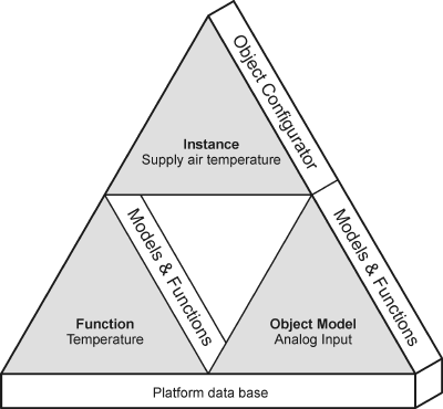
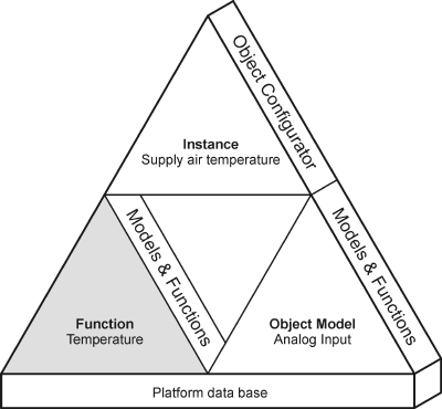
Configuration Editors
We need the following to integrate a system in Desigo CC: Interrelated Object Model, Function, and Instance. All created objects are saved as data points in the platform data base.
Configuring Object Models
Object Models must be created and changed in the Models & Function Editor; Function data mapping in the related Object Model. An Object Model is required for each data type for the corresponding system. This is required since not all object types for a given system have the same information characteristics.
Function Configuration
Function is the abstract functionality of an object and must be created or edited using the Models & Function Editor. The type and number of mapping rules for a Function can be freely selected. Temperature is, for example, a Function. It covers the object functions of a group for supply, extract and room air, and so on. It does not make sense to create a Function, for example, for each individual object, for instance, supply air temperature. This would only result in a large number of specialized Functions that provide few to no additional benefits.
Object Configuration
Instances are customized and may be modified using the Object Configurator. They reflect the number of integrated objects from the project. The operator can modify these instances as needed (for example, record history data or set up management platform alarm).

NOTE:
The open design requires a corresponding Object Model for each data point integrated into Desigo CC. The number of Object Models depends each time on the system to be integrated.
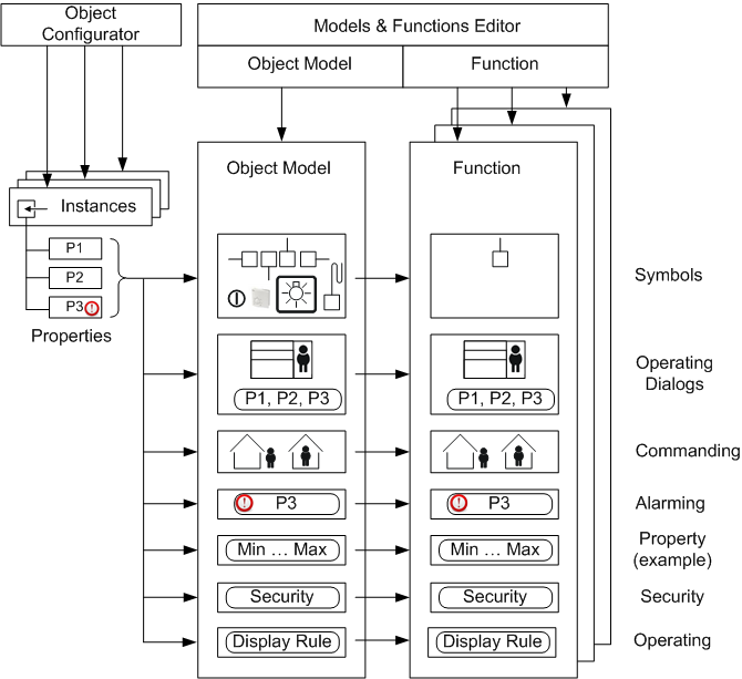
The Models & Functions Editor defines the information relevant to engineering for system objects, for example, detectors or fans. It typically defines the symbol to select during engineering or the operating information to be displayed as per the corresponding user rights. The operator can also define and configure management platform alarms using the Object Configurator.
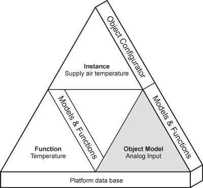
The Object Configurator is used to define the Object Model for each data type on your system, for example, Analog Input.
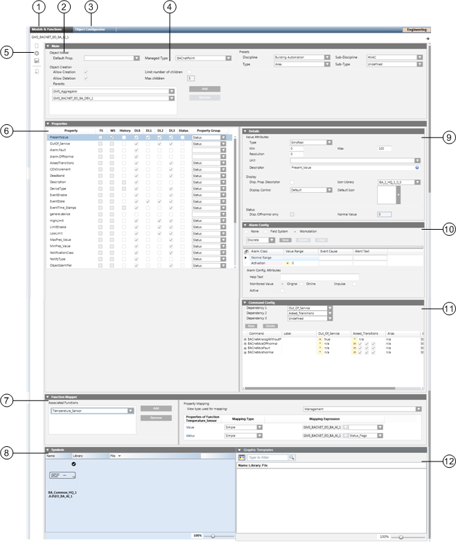
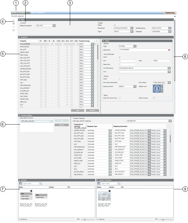
| Function/Dialog | Description |
1 | Models & Functions | Switches between the Object Model and the Functions Editor. The editor depends on the selected type (Object Model or Function). |
2 | Mode | Shows the corresponding Object Model Editor mode. |
3 | Object Configurator | Object Configurator tab to process project instances. |
4 | Main expander | Basic settings for the corresponding Object Model. |
5 | Toolbar | Toolbar for Object Models, Functions, and the Object Configurator. |
6 | Properties expander | Lists all properties for the corresponding object. |
7 | Function Mapper | Define mapping for Function properties for the Object Model properties. |
8 | Symbols expander | Symbols for the object, whereby a symbol may be defined as the default symbol. |
9 | Details expander | Detailed configuration of Value Attributes, Display as well as Status. The display of Value Attributes depends on the properties. |
10 | Alarm Configuration expander | Alarm configuration of individual object properties. |
11 | Command Configuration expander | Command configuration of individual object properties. |
12 | Graphics Templates expander | Graphics template for object, where a graphic template can be defined as default. |
Toolbar
Toolbar | |
| Creates a new object in System Browser. |
| Deletes an object in System Browser. |
| Saves the currently opened object. |
| Creates a new localized object for Region, Country or Project. |


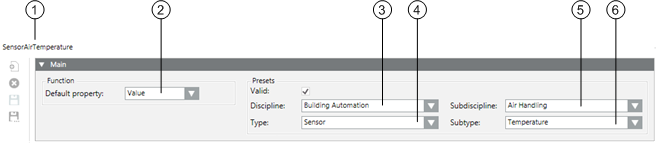
Main
In the Main expander, you can:
- Define the default property
- Assign presets for electrical and mechanical installation
- Define the response when creating new objects
| Name | Description |
1 | Object Name | Object Model designation. |
2 | Default Property | Defines the default property when none is assigned. This property displays in the Textual Viewer. |
3 | Managed Type | Defines which application is displayed when an object is selected in System Browser. Configure only if a new application is added. |
4 | Valid | Displays, based on the color code, the source used for inheriting the information. |
5 | Discipline | Category of the discipline (for example, Building Automation and Control, Security). |
6 | Type | Category of the corresponding type (for example, sensor or camera). |
7 | Subdiscipline | Subdescription of the object (for example, air handling for type BAC or evacuation for type Security). |
8 | Subtype | Subdescription of the object (for example, temperature for type sensor). |
9 | Parents | List of parent elements for the Data Point Type. Configures the object type that can be created by the application. If the Generic Create check box is selected, parent configuration specifies the type of children that can be created in the Object Configurator. |
10 | Default name | The default name is assumed when creating a child. |
11 | Limit of children | Limit release for the number of possible children. Defines the maximum number of child objects. |
12 | Generic create | Permits creation of an object in the Object Configurator. |
13 | Remove | Delete the selected element from the parent list. |
14 | Add | Add a parent element. |
15 | Read-only | The default name for a child cannot be changed. |
16 | Max. children | Defines the maximum number of child objects. |
17 | Generic delete | Permits deletion of an object in the Object Configurator. |
Object Name
Describes the name of the selected Object Model. It is derived from the platform type and must be unique within the system. Object Model names are not localized.
Object Model
- Default Property
The defined default property is inherited from the corresponding applications or the Desigo CC Viewer.
- Managed Type
Managed type defines navigation from System Browser to the corresponding application. For example, the Data Point Type scheduler can directly open the Scheduler application from System Browser.
Presets
- Discipline, Subdiscipline, Type, Subtype
The selected information helps specify the Function for which an Object Model is used in the building.
Presets | |||
Discipline | Subdiscipline | Type | Subtype |
Building Automation | Air Handling | Sensor | Frost |
Building Infrastructure | Elevators | Detector | Door |
Energy Management | Power Distribution | Switch | Binary |
Security | Door Control | Detector | Door |
NOTE:
Entries for Discipline, Subdiscipline, Type and Subtype have a direct influence on search criteria in Desigo CC.
Object Creation
- Parent
One Desigo CC child object may possess multiple parents and may be recursive. Recursivity of an Object Model means that the same Object Model type may be added at one hierarchy level lower.
Example of Object Models | ||
Network | Device | Analog Input |
Field network | Network | Device |
| Aggregator | Aggregator |
| Device |
|
- Add
Object Models may be added to this Object Model. The number of parents is unlimited.
- Remove
The selected parent element is deleted.
- Limit number of children
Defines the maximum number of child objects. For example, setting a child element (for example printer) to a maximum of 2 allows you to define a server printer and an SNMP printer.
- Generic create
When selected, a child object for the associated Object Model can be edited in the Object Configurator.
- Generic delete
When selected, a child object for the associated Object Model can be deleted in the Object Configurator.
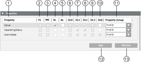
Properties
In the Properties expander, you can:
- View the properties of the alarm property
- Enable the properties for the log database
- Enable the properties for the history database
- Define display of individual operator dialogs
- Define backup setting within the system
| Property | Description |
1 | Property | List of all available properties from the Object Model. |
2 | FS | A field system alarm is defined when the check box is selected. |
3 | MS | A Management Station alarm is defined when the check box is selected. |
4 | VL | Object logged in the Value Log database for change of value |
5 | AL | Object logged in the Activity Log database for change of value |
6 | DL0 | Visibility of properties of the configuration tool (for example, BACnet Editor) |
7 | DL1 | Visibility of properties in the Status and Commands window in the graphic |
8 | DL2 | Visibility of properties in the Operation tab |
9 | DL3 | Visibility of properties in the Extended Operation tab |
10 | Status | Configuration of off-normal status for this property |
11 | Persist | Latest value is stored and used by a startup of the server platform |
12 | Property Group | Defines the security settings within the system |
DL = Display Level
Property
Each available property of an object can be individually configured. Drag-and-drop to adjust the sequence of the individual properties. Viewer display (Status and Commands window) follows the defined sequence.
Value Log (Trend)
When selected, a change in status for the data point property is entered in the Value Log database.
NOTE:
Select only if you want to record a value for all instances, for example, Life Safety Object.
Activity logs should not be released for all properties in general. Otherwise, it could result in a large amount of data depending on the project size or data frequency.
Event (Activity Log)
When selected, a change in status for the data point property is entered in the Activity Log database.
Alarm Configuration Field System (FS)
When selected, displays whether an alarm configuration is defined in the field system. The check box is read-only.
Alarm Configuration Management Platform (MS)
When selected, displays whether a management platform is defined in the Alarm expander for this property. The check box is read-only.
DL0 Configuration (BACnet Editor)
If selected, the corresponding property is displayed in the selected view.
DL1 Main Operation (Status and Commands Window in Graphic)
This window opens in the graphic when an alarm or an event occurs.
DL2 Standard (Operation)
If selected, the corresponding property is displayed in the selected view according to Function.
DL3 Details (Extended Operation)
If selected, the corresponding property is displayed in the selected view according to Object Model.
Status
If selected, it is displayed in the Operation tab during off-normal state. Other states are not displayed.
Details
In the Details expander, you can:
- Edit the Data Point Type
- Edit the property descriptive text
- Edit attribute properties
- Edit the assigned Text group
- Define the representation in the Status and Commands windows
- Define the response in the offnormal state
Group | Description |
General | Configuration of specific property types and description |
Value Attributes | The Value Attributes group box shows the attributes of the selected property type |
Array Attributes | In the Array Attributes group box, the text field is only displayed for an array property |
Display | The Display group box defines representations in the Status and Commands window |
Status | In the Status group box, the display in the offnormal state is defined |
| Name | Description |
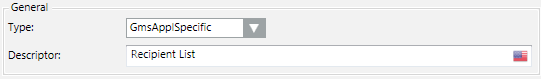
1 | Type | Defines the Data Point Type in Desigo CC. |
2 | Descriptor | Describes the property in clear text |
3 | Valid | Displays, based on the color code, the source used for inheriting the information. |
4 | …… | Optional entry fields by data type (see Value Attributes group box) |
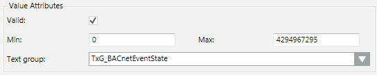
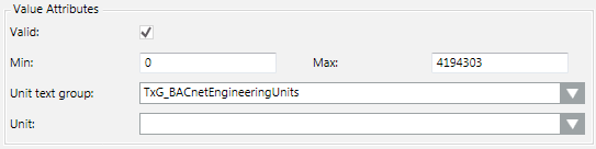
5 | Unit Text Group | List of availableText Groups |
6 | Unit | Selection list for a unit from the selected Text Group |
7 | Offnormal | When selected, does not display the normal state (only offnormal states are displayed in the Status and Commands window) |
8 | Display Control | Defines display in display control |
9 | Omit prop.descriptor | When selected, the Present Value description is displayed prior to the value |
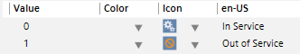
10 | Normal Value | Defines the normal state for the corresponding property |
11 | Default Icon | Defines the icon for this property. This icon is displayed if no icon is assigned to the enumeration in the text catalog |
12 | Icon Library | List of available icon libraries |
Value Attributes Group Box
The selected data point type determines the entry field available for this type.
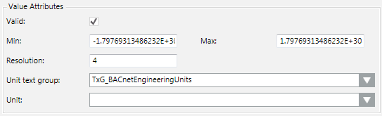
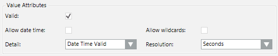
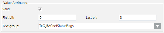
- Boolean
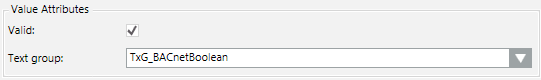
- Real
- DateTime
- BitString
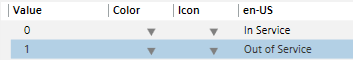
- Enumeration
- UInt
- ApplSpecific / Array
Array Attributes Group Box
The text group (for example, TxG_BACnet_Event_Transition_Bits_BACNET) assigned an array number to a corresponding text.
0 = To Offnormal
1 = To Fault
2 = To Normal
Display Group Box
- Omit prop.descriptor
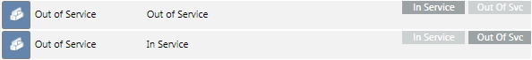
When cleared, the text Out_of_Service is also displayed for the current value in the Operation / Extended Operation tab.
Cleared |
|
Selected |
|


- Display Control
- Default: Standard control is displayed in the Operation / Extended Operation tab.

- Priority Array: Priority Array control is displayed in the Operation / Extended Operation tab. This control may only be used for the BACnet property Priority_Array.

- Event Time Stamp: Event Time Stamp control is displayed in the Operation / Extended Operation tab. This control may only be used for BACnet Event_Time_Stamps.

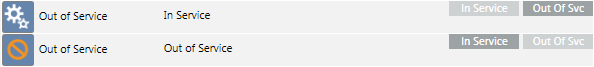
- Default Icon
The default icon  is always displayed in the Operation / Extended Operation tab if no icons are defined in the text catalog.
No Symbols Defined in the Text Group | |
View in Text Group |
|
View in Operation tab |
|
Symbols Defined in the Text Group | |
View in Text Group |
|
View in Operation tab |
|
Status Group Box
NOTE:
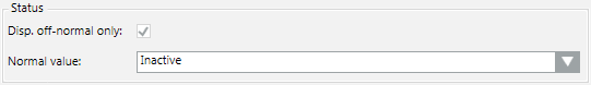
The appropriate settings may only be made if the Status check box is selected for the given property.
The Status check box must be selected in the Properties expander to define the off-normal state.
Normal state is not displayed in the individual viewer (Operation, Extended Operation) if the Disp. Offnormal only check box is selected. You can enter the value in the Normal Value entry field representing the normal state. All other abnormal states are displayed in the corresponding viewer if the value is not equal to the set normal value.
NOTE:
The entry field for defining normal state is based on the corresponding data type property (Enumeration, Real, Boolean and Bitstring) as well as the selected text catalog.
- Real/Boolean
Enter a value for Normal value.
- Enumeration
Select the appropriate value from the Normal value drop-down list box.
- BitString
Select the check box representing the Normal value.
Alarm Configuration
In the Alarm Configuration expander, you can:
- Edit a field system alarm
- Create, edit, or delete a management platform alarm
Alarm Configuration Expander | ||
| Name | Description |
1 | Valid | Displays, based on the color code, the source used for inheriting the information. |
2 | None | Defines no alarm functionality for this data point property. |
3 | Field system | Defines the alarm configuration for the field system. |
4 | Management Station | Defines the alarm functionality on the management station. |
5 | Alarm kind |
|
6 | New | Opens an input mask for defining the alarm condition in a row. Multiple alarm conditions can be defined. |
7 | Delete | Deletes the highlighted alarm condition. |
8 | Clear | Deletes all alarm conditions from the alarm table, (except the entries for Normal and Alarm). |
Entry Mask for Management Platform Alarm
| Name | Description |
1 | Alarm Class | Defines the alarm class to be enabled for an event. |
2 | Operand | Defines the condition (operand) for reporting the event. |
3 | Value Range | Defines the value at which an event is reported. |
4 | Event Text | Displays the alarm text for incoming event. |
5 | Normal Text | Displays the alarm text for outgoing event. |
6 | Alarm config. activted | When the check box is selected, the alarm is set to active. |
Supported Operands | ||
Operand | Meaning | Example |
| | | Or |
|
!| | | Nor |
|
.. | In the range of two values |
|
!.. | Not in the range of two values |
|
> | Greater than |
|
< | Less than |
|
>= | Greater than or equal to |
|
<= | Less than or equal to |
|


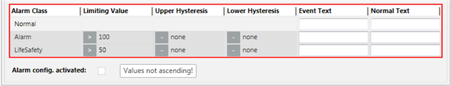
Fault indication
- The first value must be less than the second value. A valid value must be less than or equal to 30.
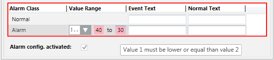
- The value sequence is not ascending. A valid value must be less than 50.
Command Configuration
In the Command Configration expander, you can:
- Define the command properties of the buttons
- Define a multiple command for a macro
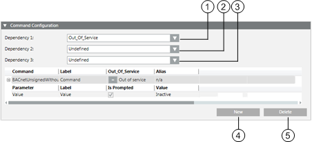
| Name | Description |
1 | Dependency 1 | Opens the column for defining the first dependency. |
2 | Dependency 2 | Opens the column for defining the second dependency. |
3 | Dependency 3 | Opens the column for defining the third dependency. |
4 | New | Opens an entry mask for defining the command rules. Multiple command conditions can be defined. |
5 | Delete | Deletes the highlighted command condition. |
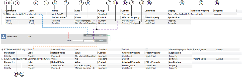
| Name / Command | Description | |
1 |
| 1. Command configuration | |
2 | Command | Command type for selected property (for example, BACnetAnalogWithPriority). | |
3 | Parameter | Displays the parameters dependent on the selected command. | |
4 | Label | Descriptive text for the button. The text is localizable, for example, en-US Manual, de-DE Manuell. | |
5 | Label | Descriptive text for operating value or priority. The text is localizable, for example, en-US Value, de-DE Wert. | |
6 | Name | This text is used for the button which can be executed by scripting. Text is not localizable. The function in the Name column must be unique (for example, WritePrio08, ReleasePrio08). | |
7 | Default Value | Defines the displayed value by the Value text field used:
| |
8 | Alias | Option to execute multiple commands (for example, alarm acknowledgement) (Alias = Ack).
Additional alias texts can be created in the Command Macro text group under Global (HQ) > Base > Texts. | |
9 | Value | Displays the value written during commanding. The value is relevant only if in Default Value (callout 7) the option Provided or DefaultProvided is selected. | |
10 | Group | Defines the Command Groups in the Scope Rights of the security definition (Standard, Event, Advanced, Ownership) used to execute the command. | |
11 | Control | Determines the software control (slider, drop-down list, text field) displayed for operation. | |
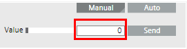
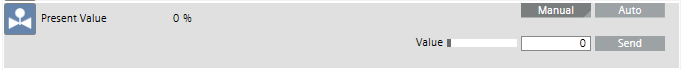
12 | Control | Expander: No direct command is executed. Clicking Command opens an entry field for the corresponding values for Value and Priority. The values are sent only with Send.
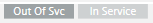
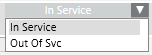
Default: The command is sent directly to the automation station when In Service or Out of Svc is used.
| |
13 | Affected Property | Defines the property used to influence the Command functionality. | |
14 | Filter Property | The defined property will be read at runtime. The assigned enumeration displays the valid text depending on this property. Example enumeration used: 0 = Close, 1 = Open, 2 = Purge, 3 = Disable, 4 = Enable Example property read at runtime: 3 = Disable, 4 = Enable The operating dialog offers the Disable and Enable options only. | |
15 | Combined | If one button is used to execute two or multiple commands, the commands can be linked by selecting the related check box. There are two options: either both commands are executed simultaneously or a command can be selected from a drop-down list box. Beispiel mit Befehl auswählen: | |
Not combined |
| ||
Combined operation |
| ||
| |||
16 | Display | Defines where the function is used:
| |
17 | Target Property | Defines which property is affected from this functionality, for example, Present_Value. | |
18 | Logging | Defines when values are written into the History Database (Always, Never or OnFailure). | |
19 |
| 2. Command configuration. | |
20 |
| Optional command configuration that integrates third party access into the command execution.. | |


Data Type States
Boolean (Out of Service) | Bit String (Status Flag) | Event (Event State) |
True | In alarm | Normal |
False | Fault | Fault |
n/a | Overridden | Off Normal |
| Out of Service | High limit |
|
| Low limit |
|
| Life safety alarm |
Dependency States
Check box key:
- State
 is not evaluated
 - State
 is selected (True)
 - State
 is cleared (False)
NOTE:
For more information on all available commands, see Commands List.
Function Mapper
In the Function Mapper expander, you can assign Functions to an Object Model.
| Name | Description |
1 | Associated Functions | List of all Functions defined in a Function Mapper for this Object Model. |
2 | Add | Adds a Function Mapper to the Object Model. |
3 | Remove | Deletes a Function Mapper from the Associated Functions list. |
4 | Properties of Function | Displays properties for the selected Function from the Associated Functions list. |
5 | Mapping Type | Defines mapping type (Simple, Functional, Extended or Mixed). |
6 | Mapping Expression | The path to a child must be provided depending on the mapping type. |
7 | View Type Used for Mapping | Application view of object references for Simple, Functional, Extended, and Mixed mapping types. |
8 | Mapping Expression Object Model | Associated Object Model for Function property. |
9 | Mapping Expression Property | Associated property assigned to the Object Model. |
View Type Used for Mapping
NOTE:
Always use the same mapping view within a system. Otherwise, Desigo CC may not be able to trigger the objects.
Mapping Types
For detailed information on individual options, see Data Model.
- Simple
- The direct mapping of a Function property to the current Object Model.

- Example: The Temperature_Sensor Function maps the Value property to the Object Model property Present_Value.
- Functional
The mapping algorithm starts at the current object and looks for an object with this Function assigned in all child objects in the view selected in View type used for mapping. Mapping to a specific property of such a Function is possible after such an object is found. Then, the property of this Function is mapped to the associated object using the Function Mapper. 
- Example: The Temperature_Sensor Function maps the Value property to the Temperature_Sensor_1 Function.
- Extended
The path is used to navigate to a child object in the related view as well as to map the configured property of such an object. 
- Mixed
This type of mapping is similar to the Functional mapping type. It allows users to add a path to the child object; the path is then used to start the selected Functional mapping algorithm. This type can be used to resolve issues, for example, two pumps in a pre-heater with the Function Pump assigned to both. In this case, the pump name can be reference to ensure unique mapping.

NOTE:
The Functional, Extendend and Mixed mapping types are used to map child objects. These mapping types serve no purpose if there is no hierarchy.
Symbols
In the Symbols expander, you prepare drag-and-drop for graphics engineering:
- Assign symbols
- Define the library style of the symbols
- Define the default symbol for each library style
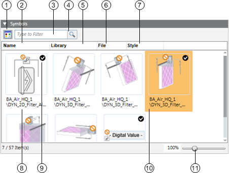
| Name | Description |
1 |
| Switch from graphical to list view. |
2 | Name | Sort the symbols by name. |
3 |
| Enter a filter criterion. |
4 |
| The symbol changes for an active filter. |
5 | Library | Sort the symbols by library. |
6 | File | Sort the symbols by file name. |
7 | Style | Sort the symbols by library style. |
8 |
| Display the complete library path for the symbol. |
9 |
| Define the default symbol for processing via drag-and-drop for each library style. |
10 |
| The selected object is highlighted in color. |
11 |
| Zoom via slider or directly enter the zoom fact in the % display. |
Use for configuration of all symbols for this object. The default symbol is taken over in the graphic via drag-and-drop. Replace the default symbol by another symbol by right-clicking and selecting Set as Default.
NOTE:
Right-click the symbol to delete, copy the reference or set the default symbol.
You can execute following workflows:
- Assigning Symbols using the Library Browser
- Deleting Symbols
Graphic Templates
In the Graphic Templates expander, you prepare drag-and-drop for graphics engineering:
- Assign graphic templates
- Define the default graphics template
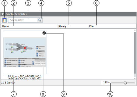
| Name | Description |
1 |
| Switch from graphical to list view |
2 | Name | Sort the graphic templates by name |
3 |
| Enter a filter criterion |
4 |
| The graphic templates change for an active filter |
5 | Library | Sort the graphic templates by library |
6 | File | Sort the graphic templates by file name |
7 |
| Displays the complete library path for the graphic templates |
8 |
| The selected object is highlighted in color |
9 |
| Defines the default graphic template for processing via drag-and-drop |
10 |
| Zoom via slider or directly enter the zoom fact in the % display |
Use for configuration of all graphic templates for this object. The default template is taken over in the graphic via drag-and-drop. Replace the default template by a related graphic template by right-clicking and selecting Set as Default.
NOTE:
Right-click the graphic template to delete, copy the reference or set the default graphic template.
Presetting Behavior
Decisive for the display or evaluation of data are the values that apply based on presettings. You can control the information by selecting or clearing the Valid check box. The following hierarchy applies to the evaluation:
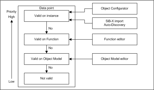
The following example illustrates the value used for display purposes for the active setting Valid based on the Minimum, Maximum, and Unit values.
Object Model | Function | Instance | Used for display | ||||||||
Min | Max | Unit | Min | Max | Unit | Min | Max | Unit | Min | Max | Unit |
-2.1E9 | 2.1E9 |
| -20 | 50 | °C | 15 | 25 | °C |
|
|
|
OR
|
OR
|
|
15 |
25 |
°C | ||||||
OR
|
|
|
-20 |
50 |
°C | ||||||
|
|
| -2.1E9 | 2.1E9 |
| ||||||
|
|
| Invalid | ||||||||


In the Function editor, you define the mapping rules for a Function, for example temperature.
| Function/Dialog | Description |
1 | Models & Functions | Switches between the Object Model and the Functions editor. The editor depends on the selected type (Object Model or Function). |
2 | Mode | Shows the corresponding Function editor mode. |
3 | Main expander | Basic settings for the corresponding Object Model. |
4 | Toolbar | Toolbar for Object Models, Functions, and the Object Configurator. |
5 | Properties expander | Lists all properties for the corresponding object. |
6 | Function Mapper | Define mapping for Function properties for the Object Model properties. |
7 | Symbols expander | Symbols for the object, whereby a symbol may be defined as the default symbol. |
8 | Details expander | Detailed configuration of Value Attributes, Displays as well as Status. |
9 | Graphic Templates expander | Graphic templates for object, where a graphic template can be defined as default template. |
Toolbar
Toolbar | |
| Creates a new Function. |
| Deletes a Function. |
| Saves the currently opened Function. |
| Saves the Function under a new name. |
| Creates a new localized object for Region, Country or Project. |


Main
In the Main expander, you can:
- Define the default property.
- Assign presets for the electrical and mechanical installation.
| Name | Description |
1 | Object Name | Function designation. Depending on the setting either the name or designation or both are displayed. |
2 | Default Property | Define the default property. |
3 | Discipline | Category of the discipline (for example, Life Safety). |
4 | Type | Category of the corresponding type (for example, Zone). |
5 | Subdiscipline | Subdescription of object (for example, Detection for Life Safety discipline). |
6 | Subtype | Subdescription of object (for example, Zone 1 for Zone type). |
Object Name
Describes the name of the selected Function. Function names must be unique for the given library. Function names are not localized.
Default Property
The defined default property is assumed by the corresponding applications or Desigo CC Viewer if no default property is available for the corresponding subsystem.
Presets
- Discipline, Subdiscipline, Type, Subtype
The selected information helps specify the Function for which a Function is used in the building.
Presets | |||
Discipline | Subdiscipline | Type | Subtype |
Building Automation | Air Handling | Sensor | Temperature |
Building Infrastructure | Elevators | Detector | Door |
Energy Management | Power Distribution | Switch | Binary |
Security | Door Control | Detector | Door |
NOTE:
Entries for Discipline, Subdiscipline, Type and Subtype have a direct influence on search criteria in Desigo CC.
Properties
In the Properties expander, you can:
- View the properties alarm property
- Enable the properties for the log database
- Enable the properties for the history database
- Define display of individual operator dialogs
- Define backup setting within the system
| Property | Description |
1 | Property | List of all available properties for the Function |
2 | FS | A field system alarm is defined when the check box is selected |
3 | MS | A management platform alarm is defined when the check box is selected |
4 | VL | Object logged in the Value Log database for change of value |
5 | AL | Object logged in the Activity Log database for change of value |
6 | DL0 | Not applicable. |
7 | DL1 | Visibility of properties in the Status and Commands window in the graphic |
8 | DL2 | Visibility of properties in the Operation ta |
9 | DL3 | Not applicable |
10 | Status | Configuration of off-normal for this property |
11 | Property Group | Defines the security settings within the system |
12 | Add | Adds a new property to the Function |
13 | Remove | Deletes an existing property from the Function |
DL = Display Level
Property
Each available property of an object can be individually configured. Drag-and-drop to adjust the sequence of the individual properties. Viewer display (Status and Commands window) follows the defined sequence.
Value Log (Trend)
When selected, a change in status for the Data Point property is entered in the Value Log database.
NOTE:
History logs should not be released for all properties in general. Otherwise, it could result in a large amount of data depending on the project size.
(Event) Activity Log
When selected, a change in status for the Data Point property is entered in the Activity Log database.
Alarm Configuration Field System (FS)
When selected, displays whether an alarm configuration is defined in the field system. The check box is read-only.
Alarm Configuration Management Platform (WS)
When selected, displays whether a management platform is defined in the Alarm expander. The check box is read-only.
DL1 Main Operation (Status and Commands Window in Graphic)
This window opens in the graphic when an alarm or event occurs.
DL2 Standard (Operation)
If selected, the corresponding property is displayed in the selected view according to Object Model.

Status
If selected, it is displayed in the Operation pane during off-normal state. Other states are not displayed.
Details
In the Details expander, you can:
- Edit the Data Point Type
- Edit the property descriptive text
- Edit attribute properties
- Edit the assigned Text group
- Define the representation in the Status and Commands windows
- Define the response in the offnormal state
Group | Description |
General | Configuration of specific property types and description |
Value Attributes | The Value Attributes group box shows the attributes of the selected property type |
Array Attributes | In the Array Attributes group box, the text field is only displayed for an array property |
Display | The Display group box defines representations in the Status and Commands window |
Status | In the Status group box, the display in the offnormal state is defined. |
| Name | Description |
1 | Type | Defines the Data Point Type in Desigo CC. |
2 | Descriptor | Describes the property in clear text |
3 | Valid | Displays, based on the color code, the source used for inheriting the information. |
4 | …… | Optional entry fields by data type (see Value Attributes group box) |
5 | Unit Text Group | List of availableText Groups |
6 | Unit | Selection list for a unit from the selected Text Group |
7 | Offnormal | When selected, does not display the normal state (only offnormal states are displayed in the Status and Commands window) |
8 | Display Control | Defines display in display control |
9 | Omit prop.descriptor | When selected, the Present Value description is displayed prior to the value. |
10 | Normal Value | Defines the normal state for the corresponding property |
11 | Default Icon | Defines the icon for this property. This icon is displayed if no icon is assigned to the enumeration in the text catalog |
12 | Icon Library | List of available icon libraries |
Value Attributes Group Box
The selected data point type determines the entry field available for this type.
- Boolean
- Real
- DateTime
- BitString
- Enumeration
- UInt
- ApplSpecific / Array
Array Attributes Group Box
The text group (for example, TxG_BACnet_Event_Transition_Bits_BACNET) assigned an array number to a corresponding text.
0 = To Offnormal
1 = To Fault
2 = To Normal
Display Group Box
- Omit prop.descriptor
When cleared, the text Out_of_Service is also displayed for the current value in the Operation / Extended Operation tab.
Cleared |
|
Selected |
|
- Display Control
- Default: Standard control is displayed in the Operation / Extended Operation tab.
- Priority Array: Priority Array control is displayed in the Operation / Extended Operation tab. This control may only be used for the BACnet property Priority_Array.
- Event Time Stamp: Event Time Stamp control is displayed in the Operation / Extended Operation tab. This control may only be used for BACnet Event_Time_Stamps.
- Default Icon
The default icon is always displayed in the Operation / Extended Operation tab if no icons are defined in the text catalog.
No Symbols Defined in the Text Group | |
View in Text Group |
|
View in Operation tab |
|
Symbols Defined in the Text Group | |
View in Text Group |
|
View in Operation tab |
|
Status Group Box
NOTE:
The appropriate settings may only be made if the Status check box is selected for the given property.
The Status check box must be selected in the Properties expander to define the off-normal state.
Normal state is not displayed in the individual viewer (Operation, Extended Operation) if the Disp. Offnormal only check box is selected. You can enter the value in the Normal Value entry field representing the normal state. All other abnormal states are displayed in the corresponding viewer if the value is not equal to the set normal value.
NOTE:
The entry field for defining normal state is based on the corresponding data type property (Enumeration, Real, Boolean and Bitstring) as well as the selected text catalog.
- Real/Boolean
Enter a value for Normal value.
- Enumeration
Select the appropriate value from the Normal value drop-down list box.
- BitString
Select the check box representing the Normal value.
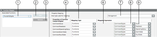
Function Mapper
In the Function Mapper expander, you can:
- Assign Functions to a Function.
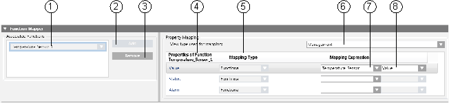
| Name | Description |
1 | Associated Functions | List of all Functions assigned by a Function Mapper to the Object Model |
2 | Add | Add a Function Mapper to Object Model |
3 | Remove | Deletes a Function Mapper from the Associated Functions list |
4 | Properties of Function | Displays properties for the selected Function from the Associated Function list |
5 | Mapping Type | Defines the mapping type (Simple, Functional, Extended or Mixed) |
6 | View type used for mapping | Application view for the object references |
7 |
| Object Model associated with Function property |
8 |
| Associated Object Model property |
NOTE:
Always use the same mapping view within a system (for example, Management View). Otherwise, Desigo CCmay not be able to trigger the objects.
Symbols
In the Symbols expander, you prepare drag-and-drop for graphics engineering:
- Assign symbols
- Define the library style of the symbols
- Define the default symbol for each library style
| Name | Description |
1 |
| Switch from graphical to list view. |
2 | Name | Sort the symbols by name. |
3 |
| Enter a filter criterion. |
4 |
| The symbol changes for an active filter. |
5 | Library | Sort the symbols by library. |
6 | File | Sort the symbols by file name. |
7 | Style | Sort the symbols by library style. |
8 |
| Display the complete library path for the symbol. |
9 |
| Define the default symbol for processing via drag-and-drop for each library style. |
10 |
| The selected object is highlighted in color. |
11 |
| Zoom via slider or directly enter the zoom fact in the % display. |
Use for configuration of all symbols for this object. The default symbol is taken over in the graphic via drag-and-drop. Replace the default symbol by another symbol by right-clicking and selecting Set as Default.
NOTE:
Right-click the symbol to delete, copy the reference or set the default symbol.
You can execute following workflows:
- Assigning Symbols using the Library Browser
- Deleting Symbols
Graphic Templates
In the Graphic Templates expander, you prepare drag-and-drop for graphics engineering:
- Assign graphic templates
- Define the default graphics template
| Name | Description |
1 |
| Switch from graphical to list view |
2 | Name | Sort the graphic templates by name |
3 |
| Enter a filter criterion |
4 |
| The graphic templates change for an active filter |
5 | Library | Sort the graphic templates by library |
6 | File | Sort the graphic templates by file name |
7 |
| Displays the complete library path for the graphic templates |
8 |
| The selected object is highlighted in color |
9 |
| Defines the default graphic template for processing via drag-and-drop |
10 |
| Zoom via slider or directly enter the zoom fact in the % display |
Use for configuration of all graphic templates for this object. The default template is taken over in the graphic via drag-and-drop. Replace the default template by a related graphic template by right-clicking and selecting Set as Default.
NOTE:
Right-click the graphic template to delete, copy the reference or set the default graphic template.